The colour theory.
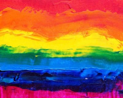
The last post you could learn a lot about combining colors. With the right choice of colors you can create atmosphere and strongly influence how things look. Maybe you have already discovered a color contrast that you particularly like?
In addition, you can read more about the theory of color theory below. Our contributor Sabrina Kraft is a graphic designer and interior designer (M.A.) and therefore a real professional in the field.
The connection between colour, contrast and effect
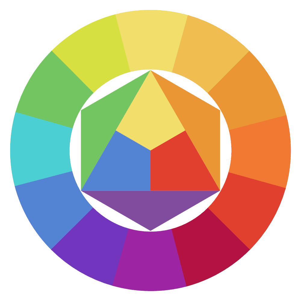
One of the best-known colour theories is probably the colour theory and the colour circle according to Itten. It is the basis of many of today’s colour models.
The focus here is on red, yellow and blue as the primary colours of subtractive colour mixing, in which theoretically all colours together produce black.
The colours can be divided as followed:
- basic colours red, yellow and blue (primary colours)
- mixed colours orange, green and violet (secondary colours)
- other mixed colours (tertiary colours)

A more advanced form of the colour wheel can be found, for example, in Harald Küpper's hexagonal colour model, which also includes today's printing inks cyan, magenta and yellow as primary colours, as well as black and white.
In this colour model, we can see that by using black and white to darken or lighten colours, a multitude of other colour nuances exist, thanks to which quite wonderful colour combinations can be created that are more harmonious and less contrasting.
Choice of colours
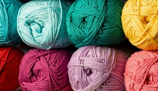
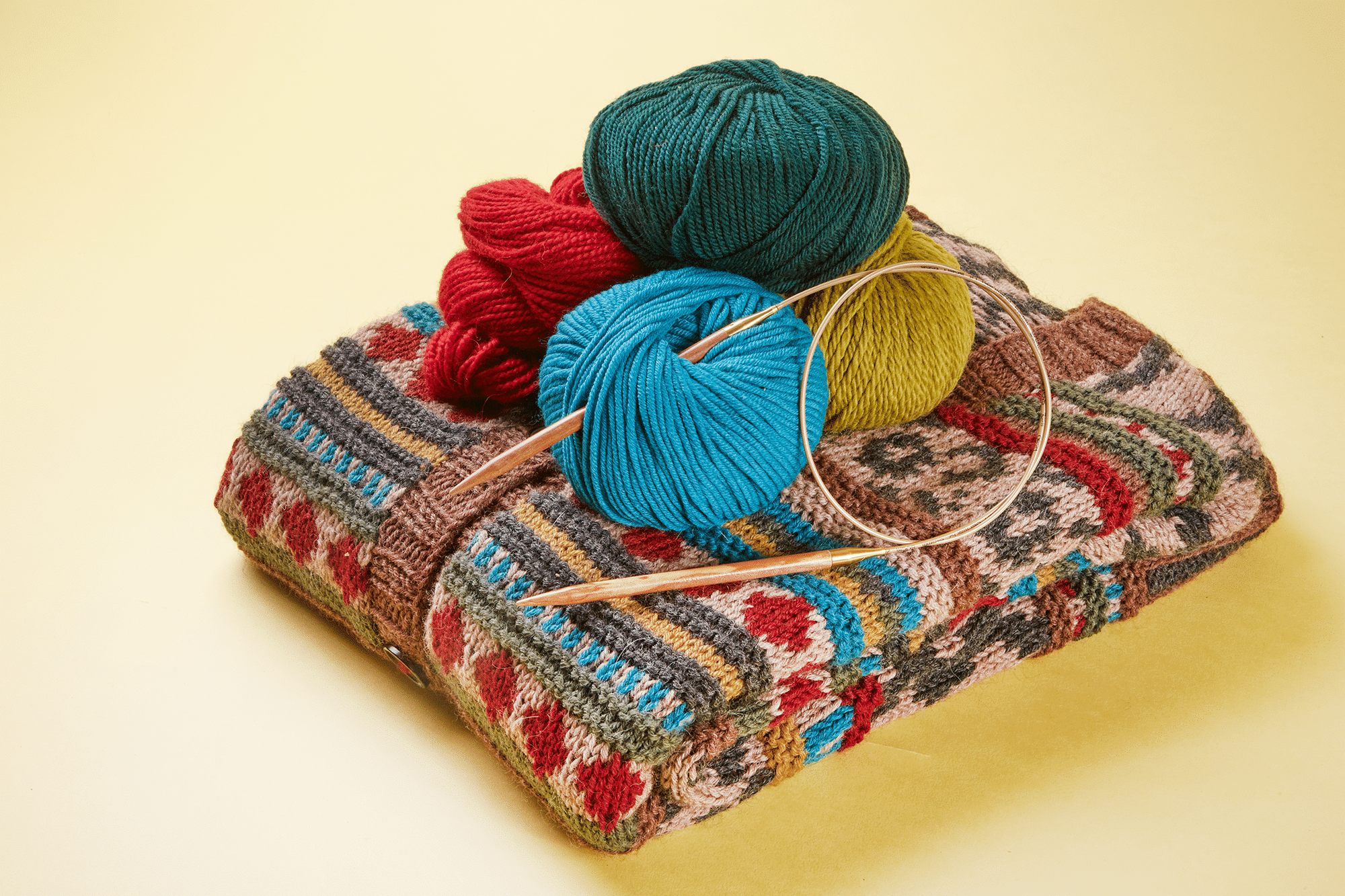
A look at one of the colour models can help you choose colours for your next knitting or crochet project. For example, if you want to find three neighbouring colours (colour relationship) or two complementary colours.
Mehr zu den unterschiedlichen Farbkontrasten erfahren Sie im Blogartikel „Das Auge strickt mit.“
No surprises
Now, in order to find the perfect colours in the wool store or online and not have any surprises, let’s finally take a little excursion into how our eye perceives colour.
Depending on the light situation, our eye can also be easily deceived. With a few advices on we can consciously avoid this.
We see colours through light receptors in the eye – there are receptors for light/dark and for the light colours rgb (red, green and blue – the basic colours of additive colour mixing). Depending on the light temperature, weather and brightness, the colour of an object can also always look different.
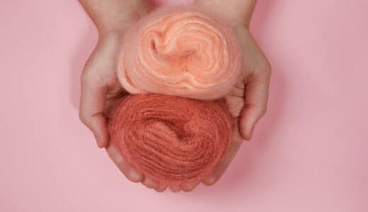
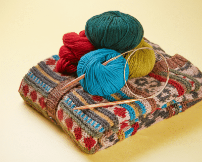

Always look at colors in the wool store in daylight,e.g. by taking the wool to the shop window. Depending on the light temperature in the store, the colors will be distorted and some color components of the wool will simply be swallowed.
If you order your wool online, it is not possible to determine the color shade exactly. Every device with a display represents the colors differently and even photos of the wool are only digitally based on the color.
Here it can help to look at the product of choice on different devices such as smartphone or computer. Also, social media often features finished knitting projects to admire, where the wool and color shade are indicated. A search can be helpful.
